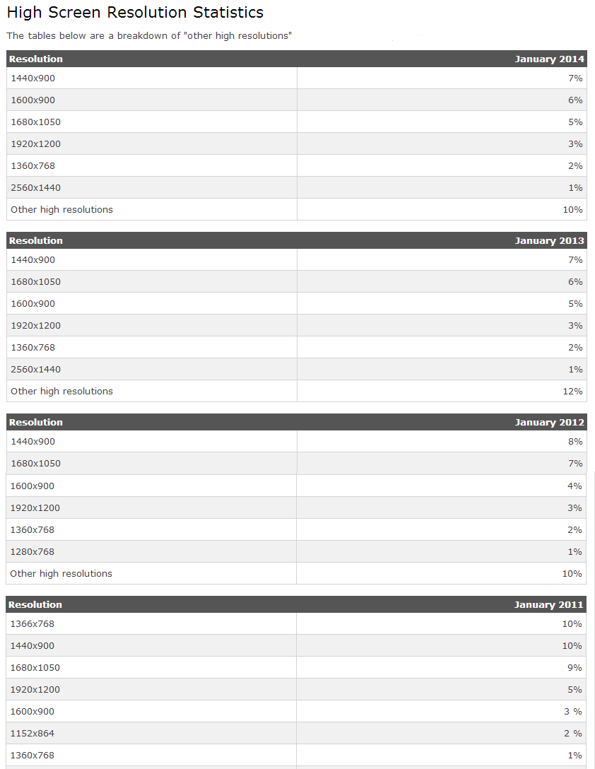
Higher screen resolutions ultimately make everything look smaller. 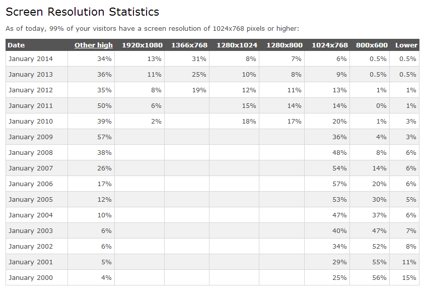
A very small percentage of Internet users are still using older resolutions like the once popular 800×600.
Sites using a 720px width appear very small on high resolution screens, and don’t leave room for a sidebar. Now most websites are staying somewhere around 960px wide. Some sites are even catering to the latest technology with much wider sites.

Although it is important to consider the newest devices, I believe the optimal website width is still 960px wide. This width caters to the majority of devices and makes your site fit nicely in both 1024px and 1366px wide screens.
960 is divisible by 2, 3, 4, 5, 6, 8, 10, 12, and 15. It is a dream for making a perfect grid site. This leads to the popular resource called the “960 grid system“.
No comments:
Post a Comment
Thank you for your Comment....